로그인 페이지 코드 분석
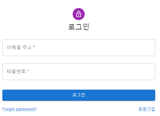
전체 페이지

코드 분석
로그인 창 아래 copyright 부분을 구현한 코드
function Copyright(props) { return ( <Typography variant="body2" color="text.secondary" align="center" {...props} > {"Copyright © "} <Link color="inherit" href="https://mui.com/"> 소셜 가계부 </Link>{" "} {new Date().getFullYear()} {"."} </Typography> ); }
1.
variant="body2" color="text.secondary" align="center" {...props}
Typography 컴포넌트
https://mui.com/customization/typography/
Typography - MUI
The theme provides a set of type sizes that work well together, and also with the layout grid.
mui.com
다양한 스타일의 텍스트를 연출할 수 있다.
variant
텍스트의 크기를 제어하는 prop
html 태그 결정
component prop로 태그명을 명시해 줄 수도 있다.
color
텍스트의 색상을 제어하는 prop
출처: https://mui.com/system/palette/
align
텍스트 정렬 prop
{...props}
spread 연산. 전달받은 파라미터 값을 설정하는 부분이다. 이 코드에서는 아래에서 다음과 같이 인자값을 받고 있다.
<Copyright sx={{ mt: 5 }} />
따라서 다음의 결과를 화면에 출력하게 된다.
<Typography variant="body2" color="text.secondary" align="center" sx={{ mt: 5 }} >
2.
<Link color="inherit" href="https://mui.com/"> 소셜 가계부 </Link>{" "} {new Date().getFullYear()} {"."}
Link
Link API - MUI
API documentation for the React Link component. Learn about the available props and the CSS API.
mui.com
color
- Link의 색깔.
- inherit: 상속. Typography의 글자색과 동일
href: 링크 이동 주소
newDate()
현재 시간 객체
- getFullYear(): 년도
로그인 폼을 구성하는 코드
1.
const theme = createTheme(); <ThemeProvider theme={theme}>
Theme
https://mui.com/customization/theming/
Theming - MUI
Customize MUI with your theme. You can change the colors, the typography and much more.
mui.com
ThemeProvider
| Name | Type | Description |
| children * | node | Your component tree. |
| theme * | union: object | func | A theme object, usually the result of createTheme(). The provided theme will be merged with the default theme. You can provide a function to extend the outer theme. |
Examples
import * as React from 'react'; import ReactDOM from 'react-dom'; import { red } from '@mui/material/colors'; import { ThemeProvider, createTheme } from '@mui/material/styles'; const theme = createTheme({ palette: { primary: { main: red[500], }, }, }); function App() { return <ThemeProvider theme={theme}>...</ThemeProvider>; } ReactDOM.render(<App />, document.querySelector('#app'));
2.
<Grid container component="main" sx={{ height: "100vh" }}> <CssBaseline /> <Grid item xs={false} sm={4} md={7} sx={{ backgroundImage: "url(https://source.unsplash.com/random)", backgroundRepeat: "no-repeat", backgroundColor: (t) => t.palette.mode === "light" ? t.palette.grey[50] : t.palette.grey[900], backgroundSize: "cover", backgroundPosition: "center", }} />
Grid
https://mui.com/components/grid/
React Grid component - MUI
The Material Design responsive layout grid adapts to screen size and orientation, ensuring consistency across layouts.
mui.com
- 기본적으로 material ui는 12개의 grid로 이루어져 있다.
- xs (extra-small) : 0px ~ 600px
- sm (small) : 600px ~ 959px
- md (medium): 960px ~ 1279px
- lg (large) : 1280px ~ 1919px
- xl (extra-large) : 1920px ~
xs={false} sm={4} md={7}
sm = {4} 는 반응형 사이즈에서 차지하는 열의 수
<Grid item xs={12} sm={8} md={5} component={Paper} elevation={6} square> <Box sx={{ my: 8, mx: 4, display: "flex", flexDirection: "column", alignItems: "center", }} > <Avatar sx={{ m: 1, bgcolor: "secondary.main" }}> <LockOutlinedIcon /> </Avatar> <Typography component="h1" variant="h5"> 로그인 </Typography> <Box component="form" noValidate onSubmit={handleSubmit} sx={{ mt: 1 }} > <TextField margin="normal" required fullWidth id="email" label="이메일 주소" name="email" autoComplete="email" autoFocus /> <TextField margin="normal" required fullWidth name="password" label="비밀번호" type="password" id="password" autoComplete="current-password" /> <Button type="submit" fullWidth variant="contained" sx={{ mt: 3, mb: 2 }} > 로그인 </Button> <Grid container> <Grid item xs> <Link href="#" variant="body2"> Forgot password? </Link> </Grid> <Grid item> <Link href="/signup" variant="body2"> {"회원가입"} </Link> </Grid> </Grid> <Copyright sx={{ mt: 5 }} /> </Box> </Box> </Grid>
1.
component={Paper} elevation={6}Paper componenet
https://mui.com/components/paper/
React Paper component - MUI
In Material Design, the physical properties of paper are translated to the screen.
mui.com
2.
mt: margin-top
mb: margin-bottom
3.
noValidate: 유효성 검사 하지 않음.
ex. 유효성 검사 실행 시, input 태그의 타입이 email인 경우 form에 @을 포함한 이메일 형식이 와야만 함.
4.
required: <input> 태그의 required 속성은 폼 데이터(form data)가 서버로 제출되기 전 반드시 채워져 있어야 하는 입력 필드를 명시한다. (출처: http://www.tcpschool.com/html-tag-attrs/input-required)
참고 사이트
<Material UI Typography 컴포넌트>
https://www.daleseo.com/material-ui-typography/
Material UI 소개 및 Typography 컴포넌트 사용법
Engineering Blog by Dale Seo
www.daleseo.com
<spred와 rest>
https://learnjs.vlpt.us/useful/07-spread-and-rest.html#spread
07. spread 와 rest 문법 · GitBook
07. spread 와 rest 이번에는 ES6 에서 도입된 spread 와 rest 문법에 대해서 알아보겠습니다. 서로 완전히 다른 문법인데요, 은근히 좀 비슷합니다. spread 일단 spread 문법부터 알아봅시다. spread 라는 단어
learnjs.vlpt.us
https://soopdop.github.io/2020/12/02/rest-and-spread-in-javascript/
JavaScript(ES6)의 Spread 와 Rest 쉽게 설명하기
JavaScript(ES6)의 Spread 와 Rest 쉽게 설명하기
soopdop.github.io
<item sm, md, lg>
https://www.dmcinfo.com/latest-thinking/blog/id/10114/a-simple-guide-to-material-ui-grids
A Simple Guide to Material UI Grids
If you’ve ever had to work with UI frameworks, you know that they can save lots of time on a project. I recently set up a layout for a complicated system using Material UI Grids for the first time. Since I didn't find any simple tutorials to follow, I
www.dmcinfo.com
<sx prop>
https://dev.classmethod.jp/articles/prepare-to-move-mui-v4-to-v5/
MUI v4에서 v5로 이사 준비 | DevelopersIO
Material UI라 불리던 라이브러리가 버전 5가 나오면서 MUI로 이름이 변경되고, 여러가지 변경점이 생겼습니다. MUI 버전 4의 마이너 버전을 사용하고 있었는데, 아예 버전 4의 마지막 버 …
dev.classmethod.jp
'웹 프로그래밍 > React' 카테고리의 다른 글
| 리액트 공부 내용 정리 (0) | 2023.09.14 |
|---|---|
| [React] 상위 컴포넌트에서 하위 컴포넌트로 데이터 전달하기(props) (0) | 2023.09.05 |
| [React] Link to 밑줄 없애기 (0) | 2022.04.10 |
| [React]material ui 대시보드 템플릿 설치 (0) | 2022.03.29 |
| [React, FrontEnd] 웹 사이트 프로젝트 일지-1. 프로젝트 생성과 material ui 설치, 템플릿 이용해서 로그인 및 회원가입 페이지 구현(중단) (0) | 2022.03.28 |
| [생활코딩]React 강좌 내용 정리5(Create, Update, Delete) (0) | 2022.03.20 |


